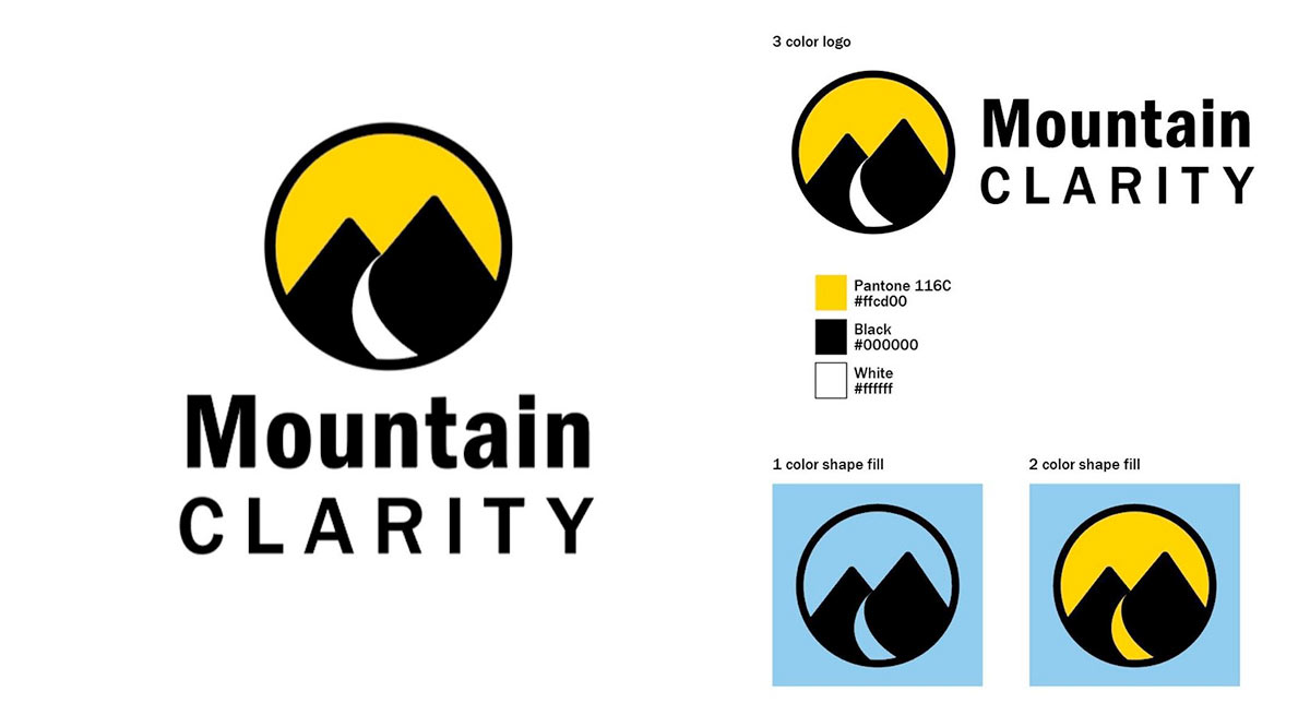
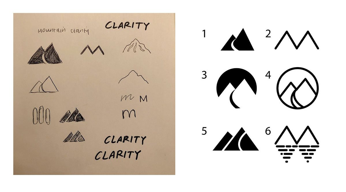
Mountain Clarity Logo Design
Jansen Wendlandt wanted a logo for his consulting company with a strong, contemporary graphic mark. We were both really pleased that the final logo incorporated both an "M" and "C" shape, while also providing the image of a path to symbolize how Jansen's services could help a company or organization to move upward and forward.
Contact
Please contact me at
©2021 Corrie Haffly. All rights reserved.